The power of paint to transform a room cannot be overstated. A fresh coat of color on your walls can completely revolutionize the atmosphere, mood, and perceived size of any space in your home. Whether you’re looking to create a serene sanctuary in your bedroom, an energizing workspace in your home office, or a sophisticated gathering place in your living room, the right paint choice serves as the foundation for your entire design scheme. Paint is one of the most cost-effective and impactful ways to refresh your interior, offering endless possibilities to express your personal style while enhancing the functionality of each room.
In today’s world of interior design, paint has evolved far beyond simple solid colors on four walls. Modern room paint ideas encompass creative techniques like color-blocking, ombre effects, textured finishes, and strategic accent walls that add architectural interest to otherwise ordinary spaces. The psychological impact of color is well-documented, with certain hues promoting relaxation, others encouraging productivity, and some creating warmth and intimacy. Understanding how to harness these effects through thoughtful paint application can dramatically improve your daily living experience.
This comprehensive guide explores twenty-five inspiring room paint ideas that span various styles, color palettes, and application techniques. From bold statement walls in jewel tones to subtle neutral schemes that provide timeless elegance, these concepts demonstrate how paint can address diverse aesthetic preferences and practical needs. Whether you’re drawn to contemporary minimalism, traditional elegance, coastal tranquility, or eclectic boldness, you’ll discover paint ideas that resonate with your vision and inspire your next home transformation project.
1. Navy Blue Accent Wall in Contemporary Bedroom

A sophisticated navy blue accent wall creates an immediate focal point in a contemporary bedroom, establishing depth and drama without overwhelming the space. This room paint idea demonstrates the power of the single accent wall technique, where one wall receives special color treatment while the remaining three walls maintain a neutral backdrop. The deep navy, applied in a matte finish, absorbs light in a way that creates richness and dimension, particularly effective behind a bed where it frames the sleeping area like a modern architectural element. The contrast between the dark navy and soft white walls produces a balanced visual tension that feels both calming and purposeful.

The navy accent wall serves multiple design functions beyond pure aesthetics. It visually anchors the bed, creating a natural headboard effect even without physical furniture, while the dark color makes the wall appear to recede slightly, adding perceived depth to the room. The matte finish eliminates glare and reflections, contributing to the bedroom’s restful atmosphere essential for quality sleep. When morning light streams through sheer curtains, it interacts beautifully with the navy surface, revealing subtle undertones and creating gentle shadows that change throughout the day.

The minimal furnishing approach complements this paint treatment perfectly, with a light oak platform bed and white linens providing clean contrast against the navy backdrop. A single brass wall sconce mounted on the accent wall adds a warm metallic element that prevents the color scheme from feeling too cool or stark. This restrained accessory choice ensures the painted wall remains the room’s defining feature.

Key Design Tips:
- Select a true navy with slight blue undertones rather than navy that leans purple or black for the most versatile look
- Use painter’s tape and multiple thin coats for crisp, professional edges where the navy meets white walls
- Position the accent wall behind the bed for maximum impact and to create a natural focal point
- Keep bedding and furniture minimal to allow the bold wall color to take center stage
- Consider the room’s natural light exposure when choosing your navy shade—north-facing rooms may need slightly warmer navy tones
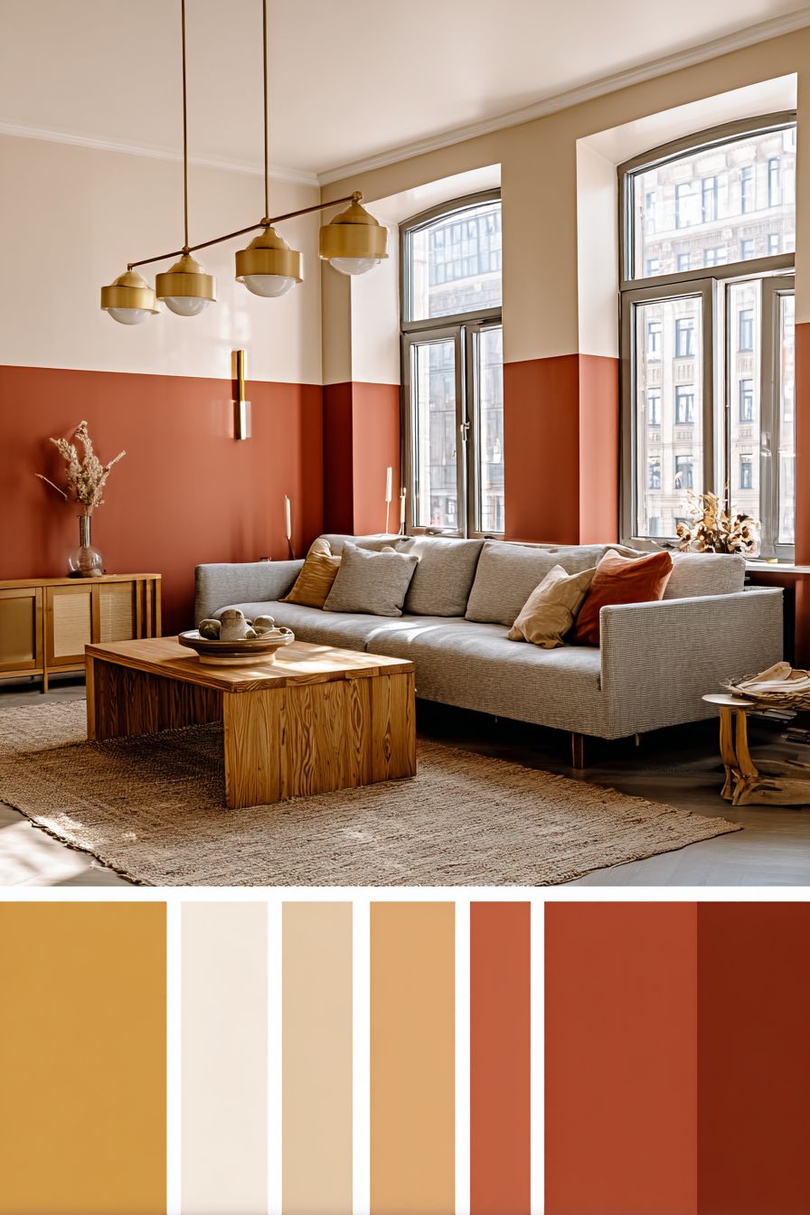
2. Sage Green Serenity Throughout Living Room

Enveloping a living room in warm sage green paint creates an immediately calming atmosphere that brings the tranquility of nature indoors. This room paint idea applies color consistently across all four walls, demonstrating how a single well-chosen hue can unify a space while providing sufficient visual interest through its natural depth and complexity. The sage green, with its perfect balance of grey and green undertones, reads as sophisticated rather than overly earthy, making it suitable for contemporary and traditional interiors alike. An eggshell finish provides subtle light reflection that keeps the space from feeling flat while maintaining enough matte quality to hide minor wall imperfections.

The psychological benefits of green hues in living spaces are well-documented, with this particular shade promoting relaxation and mental clarity without inducing drowsiness. As natural light moves through the room throughout the day, the sage green walls reveal different facets of their character—appearing more grey in morning light, more green as afternoon sun intensifies, and taking on warm, embracing tones in evening lamplight. This dynamic quality ensures the room never feels static or boring despite the monochromatic wall treatment.

Furnishing choices that complement sage green walls include cream and natural linen textiles, which provide soft contrast without competing for attention. The natural jute rug and wooden coffee table introduce organic textures that harmonize with the nature-inspired wall color, creating a cohesive biophilic design scheme. White trim around windows and along baseboards creates crisp definition that prevents the green from appearing muddy or undefined, establishing clear architectural boundaries that give the room structure.

The beauty of sage green as an all-over wall color lies in its versatility as a backdrop for evolving decor. Whether you prefer minimalist Scandinavian aesthetics, bohemian layered textiles, or traditional wood furnishings, sage green provides a neutral-yet-colorful foundation that accommodates diverse styling directions. It pairs beautifully with both warm and cool accent colors, from terracotta and brass to navy and black, making it an excellent choice for those who like to refresh their decor seasonally.
Key Design Tips:
- Test sage green samples on all walls before committing, as lighting varies significantly between walls in the same room
- Choose an eggshell or satin finish for living rooms to allow for easy cleaning while maintaining a soft appearance
- Incorporate white or cream trim to define architectural features and prevent the green from overwhelming the space
- Layer multiple shades of green through plants, textiles, and accessories to create depth within the monochromatic scheme
- Balance the cool undertones of sage with warm wood furniture and brass or gold metallic accents
3. Charcoal and White Two-Tone Dining Room

The sophisticated drama of a two-tone dining room paint treatment divides walls horizontally, with charcoal grey below a chair rail and crisp white above, creating instant architectural interest in an otherwise simple space. This room paint idea draws from traditional wainscoting and dado rail concepts but modernizes them through color choice and clean execution. The charcoal lower section grounds the room visually while providing practical durability in high-traffic areas where chairs might scuff walls, while the white upper section lifts the ceiling visually and reflects light to prevent the dark lower color from making the space feel cave-like.

The division line, marked by subtle chair rail molding, creates a horizontal element that changes the room’s proportions, making it feel wider and more expansive. This technique works particularly well in dining rooms with standard eight or nine-foot ceilings, where the strategic placement of the dividing line at approximately one-third of the wall height (around 30-36 inches) creates ideal visual balance. The contrast between the two paint colors provides a dramatic backdrop for dining furniture without requiring bold patterns or busy wallpaper.

Natural light plays beautifully across this two-tone treatment, with the white upper walls bouncing daylight deeper into the room while the charcoal lower section absorbs light to create grounding weight. The wooden dining table and black metal chairs bridge both paint colors, picking up the darkness below while their natural materials prevent the scheme from feeling too stark or modern. Brass pendant lights hanging above the table introduce warm metallic tones that soften the grey and white palette, creating inviting ambiance for evening dining.

This paint treatment demonstrates exceptional versatility in accommodating various dining styles. Whether you prefer formal traditional dining with crystal and china, casual farmhouse gatherings, or contemporary minimalist entertaining, the two-tone walls provide a neutral-yet-distinctive backdrop that enhances rather than dictates your styling choices. The charcoal and white combination also photographs beautifully, making it an excellent choice for those who enjoy entertaining and sharing their home on social media.
Key Design Tips:
- Position the chair rail at one-third of the wall height for classical proportions, or experiment with lower placement for more dramatic contrast
- Use a level and measuring tape to ensure the dividing line stays perfectly horizontal around the entire room
- Paint the upper section first, then tape it off before applying the darker lower color to prevent bleed-through
- Select charcoal with slight warm undertones to prevent the room from feeling cold or institutional
- Coordinate wall colors with your dining table and chairs—the division can visually align with tabletop height for added cohesion
4. Blush Pink Minimalist Home Office

Soft blush pink walls transform a home office into a calm, focused workspace that defies the expectation of sterile white or boring beige. This room paint idea proves that color and minimalism can coexist beautifully, with the gentle pink providing personality and warmth while maintaining the clean simplicity essential for productive work environments. The matte finish eliminates screen glare and creates a soft, non-distracting backdrop for concentrated tasks, while the color’s psychological properties promote creativity and reduce stress without the sedative effect of deeper, more saturated pinks.

The subtle texture visible in natural light adds dimension to the painted surface without requiring additional decorative treatments or busy patterns that might fragment attention during work hours. This barely-there texture catches light at different angles throughout the day, creating gentle visual interest that prevents the walls from appearing flat or monotonous during long work sessions. The blush tone reads as surprisingly neutral when balanced with white furniture and minimal black accents, creating a sophisticated color scheme that feels grown-up and professional rather than overly feminine or childish.

White floating shelving and a clean-lined desk provide essential contrast against the pink walls, their stark whiteness appearing even crisper and more defined against the colored backdrop. This strategic contrast helps visually organize the workspace, with white elements reading as functional zones while the pink walls provide a cohesive envelope that unifies the room. A single modern desk lamp with clean geometry maintains the minimalist aesthetic while providing task lighting that complements the soft overall ambiance created by the wall color.

The beauty of blush pink in a home office setting lies in its ability to humanize a workspace without sacrificing professionalism. During video calls, the colored wall serves as a distinctive backdrop that adds personality and visual interest without competing with your presence on screen. The warm undertones in quality blush paint create a flattering environment for video meetings while the overall softness prevents the harshness sometimes associated with bright white walls and direct overhead lighting.
Key Design Tips:
- Choose blush pink with warm peachy undertones rather than cool lavender-pinks for the most universally flattering effect
- Apply matte or flat finish to minimize screen glare from computer monitors and eliminate distracting reflections
- Keep furniture and accessories predominantly white or light wood to maintain the minimalist aesthetic and prevent color overload
- Position your desk to avoid direct sunlight hitting your screen, but where natural light illuminates the pink walls to show their depth
- Add one or two deeper pink accessories (like a desk organizer or mouse pad) to tie the wall color into your workspace styling
5. Light Grey Traditional Bedroom

Classic light grey walls provide a timeless foundation for a traditional bedroom that feels simultaneously elegant and restful. This room paint idea demonstrates how neutral doesn’t mean boring, with the grey serving as a sophisticated backdrop that allows architectural details like crown molding and baseboards to take center stage. The low-sheen finish catches light gently without creating the flatness of matte paint or the obvious shine of satin, striking an ideal balance for bedroom walls where you want subtle elegance rather than dramatic effects. White trim creates crisp definition around windows, doors, and along the ceiling, establishing clear architectural boundaries that give the grey walls proper framing.

The grey chosen for this application sits firmly in the light range, providing enough contrast with white trim to be noticeable while remaining pale enough to keep the bedroom feeling airy and spacious. This careful calibration ensures the room maintains the peaceful, expansive quality essential for restful sleep while introducing more character than stark white walls. The grey’s neutral temperature—neither warm nor cool—makes it exceptionally versatile for accommodating various bedding colors and furniture woods without clashing or creating unwanted color casts.

Layering grey on grey through textiles and furniture creates sophisticated depth without requiring bold color contrasts. A tufted grey upholstered bed echoes the wall color in a different texture and slightly deeper shade, while white nightstands provide crisp punctuation points that prevent the monochromatic scheme from blending together indistinctly. Natural light filtering through plantation shutters creates beautiful striped shadow patterns on the painted walls, adding dynamic visual interest that changes throughout the day without permanent decorative commitment.

Traditional bedroom styling finds a perfect partner in light grey walls, which provide enough neutrality to showcase antique furniture, classical artwork, and ornate textiles without competing for attention. The grey serves as a bridge between warm wood tones and cool white linens, harmonizing elements that might otherwise clash in a more colorfully painted room. This diplomatic quality makes light grey particularly valuable in shared bedrooms where two people’s style preferences must coexist peacefully.
Key Design Tips:
- Sample several light greys on your bedroom walls before deciding, as undertones become very apparent in different lighting conditions
- Choose grey with slight warm undertones for north-facing bedrooms to prevent a cold, unwelcoming atmosphere
- Paint crown molding, baseboards, and window trim in pure white to create definition and prevent the grey from appearing muddy
- Layer various shades of grey through bedding, rugs, and window treatments to create depth within the neutral palette
- Incorporate metallics like brushed nickel or chrome to complement the cool undertones of grey walls
6. Sunny Yellow Kitchen Accent Wall

A vibrant yellow accent wall behind open kitchen shelving injects instant energy and optimism into the culinary workspace while demonstrating the transformative power of strategic color placement. This room paint idea proves that bold hues can work in practical spaces when applied thoughtfully, with the yellow limited to a single wall to prevent overwhelming the room’s relatively small footprint. The satin finish provides essential durability for kitchen environments where grease, moisture, and food splatter are inevitable, while its slight sheen reflects light beautifully to amplify the color’s inherent brightness. Warm white on remaining walls provides necessary visual relief, allowing eyes to rest while maintaining the kitchen’s overall bright, airy character.

The psychological impact of yellow in kitchens aligns perfectly with the room’s function as a gathering place for nourishment and connection. Yellow stimulates appetite, encourages conversation, and creates an inherently optimistic atmosphere that makes morning coffee rituals and meal preparation more enjoyable. As natural daylight streams through windows, it amplifies the yellow’s warmth and vitality, while evening artificial lighting brings out the color’s rich, golden undertones. This dynamic quality ensures the kitchen feels welcoming and energizing regardless of the time of day.

White cabinetry provides clean contrast that prevents the yellow from feeling overwhelming or garish, while butcher block countertops introduce warm wood tones that harmonize with the sunny wall color. The natural material palette—yellow paint, white cabinets, wood counters, stainless steel appliances—creates a balanced scheme where no single element dominates. Open shelving mounted on the yellow accent wall showcases white dishes and glassware that pop dramatically against the colored backdrop, turning functional storage into decorative display that celebrates everyday objects.

This paint treatment demonstrates smart spatial awareness, using color to draw attention to the kitchen’s most aesthetically pleasing feature—the open shelving display—while the white surrounding walls recede visually. The yellow accent wall effectively creates a focal point in a room type that often lacks architectural distinction, transforming a utilitarian space into one with personality and charm. The color choice also provides flexibility for seasonal decoration, working equally well with spring pastels, summer brights, autumn earth tones, or winter metallics.
Key Design Tips:
- Choose sunny yellow with warm undertones rather than acidic or greenish yellows for the most universally appealing kitchen atmosphere
- Apply satin or semi-gloss finish for easy cleaning and moisture resistance essential in kitchen environments
- Limit yellow to one wall to prevent the color from becoming overwhelming in a small kitchen space
- Use the accent wall to highlight your kitchen’s best feature, whether open shelving, a beautiful window, or architectural detail
- Balance bold yellow with plenty of white and natural materials to prevent the space from feeling too intense or childlike
7. Deep Teal Spa-Like Bathroom

Transforming a bathroom into a personal spa sanctuary begins with deep teal walls that envelop the space in luxurious color reminiscent of tropical waters and precious gemstones. This room paint idea demonstrates how bold, saturated color can work beautifully in small spaces when applied with confidence and complemented by appropriate materials. The semi-gloss finish serves dual purposes—providing essential moisture resistance for humid bathroom environments while creating a subtle sheen that mimics water’s reflective quality, reinforcing the aquatic spa atmosphere. White subway tile wainscoting on the lower wall section introduces classical architecture while providing practical splash protection in high-moisture areas.

The depth and complexity of teal as a color choice creates sophisticated ambiance that feels decidedly adult and luxurious. Unlike lighter aquas or turquoises that lean beachy and casual, this deeper teal reads as opulent and intentional, evoking high-end hotel bathrooms and exclusive spas. The color’s blue-green balance provides psychological benefits of both hues—the calming properties of blue combined with the refreshing, rejuvenating qualities of green—making it ideal for a room dedicated to cleansing and self-care rituals.

Brass fixtures introduce warm metallic accents that create stunning contrast against the cool teal walls, their golden tones bringing out subtle green undertones in the paint while adding a layer of vintage-inspired elegance. A vintage-style mirror with an ornate brass frame serves as jewelry for the walls, its reflective surface bouncing light around the room to prevent the deep color from feeling cave-like or claustrophobic. The strategic combination of dark walls with light-reflecting elements ensures the bathroom feels cocoon-like and intimate rather than cramped or dreary.

Natural light filtering through a frosted window combines with recessed lighting to illuminate the teal walls from multiple angles, revealing the color’s remarkable depth and the slight variations in tone across the surface. This layered lighting approach ensures functionality for practical tasks like applying makeup or shaving while maintaining the moody, atmospheric quality that makes the bathroom feel like a true retreat from daily stress.
Key Design Tips:
- Select semi-gloss or high-gloss finish for bathroom walls to provide moisture resistance and prevent mildew growth
- Apply white wainscoting or tile on lower walls to protect against water damage and create classic architectural detail
- Choose warm metallic fixtures in brass or gold to complement teal’s undertones and add luxurious contrast
- Install adequate lighting from multiple sources to prevent deep teal from making the bathroom feel dark or cave-like
- Use a high-quality bathroom-specific primer before painting to ensure proper paint adhesion in humid environments
8. Soft Greige Farmhouse Living Room

The sophisticated warmth of greige—that perfect marriage of grey and beige—creates an ideal neutral backdrop for farmhouse-style living rooms that balance rustic charm with contemporary sensibility. This room paint idea demonstrates the power of complex neutrals that read as restful backgrounds while providing more character than stark white or builder beige. The flat matte finish absorbs light without reflection, creating a soft, velvety appearance on walls that serves as the perfect canvas for displaying the room’s authentic farmhouse elements without competing for attention. The greige tone bridges warm and cool elements naturally, harmonizing exposed wooden beams with white shiplap and creating cohesion between disparate materials.

Greige’s particular genius lies in its chameleonic nature, appearing slightly more grey in cool morning light and revealing its beige warmth as afternoon sun intensifies. This adaptive quality ensures the room feels appropriate and welcoming throughout the day’s changing light conditions, never appearing too stark or too muddy. The neutral walls allow the farmhouse’s architectural features—exposed beams, shiplap fireplace surrounds, and wide-plank floors—to command attention as the room’s defining characteristics rather than competing with bold wall colors.

White shiplap installed on the fireplace wall provides crisp contrast against the greige surroundings, creating a focal point that celebrates traditional farmhouse aesthetics while maintaining the overall neutral scheme. Distressed furniture pieces in various wood tones find harmony against the greige backdrop, which provides enough contrast to define furniture silhouettes while remaining neutral enough not to clash with multiple wood finishes. Large windows dressed simply allow maximum natural light penetration, showcasing the greige walls’ versatility and depth throughout changing daylight conditions.

The beauty of greige in farmhouse settings lies in its ability to feel simultaneously timeless and current, honoring traditional rural aesthetics while incorporating the clean, edited sensibility of contemporary design. It provides sufficient contrast with white trim and light wood floors to create definition, while its warmth prevents the space from feeling cold or sterile despite the simplified color palette. This balance makes greige particularly valuable for open-concept homes where living spaces flow into kitchens and dining areas, providing continuity without monotony.
Key Design Tips:
- Test greige samples in both morning and afternoon light to ensure the color balance works throughout the day
- Choose greige with slightly warm undertones to complement natural wood elements common in farmhouse design
- Apply flat or matte finish to create the soft, non-reflective surface that suits relaxed farmhouse aesthetics
- Paint trim and architectural details in pure white to create definition and prevent greige from appearing muddy
- Layer various neutral textiles in cream, tan, and soft grey to create depth within the neutral palette
9. Gentle Mint Green Nursery

Creating a soothing environment for a baby begins with gentle mint green walls that provide calming color without the predictable pink or blue gender associations. This room paint idea prioritizes the infant’s wellbeing with zero-VOC paint formulations that eliminate harmful chemical off-gassing, ensuring the nursery’s air quality remains pristine for developing lungs. The soft matte appearance creates a peaceful, non-stimulating backdrop essential for promoting healthy sleep patterns, while the color’s natural freshness evokes springtime growth and new beginnings—perfect symbolism for a baby’s room. The pale intensity ensures the mint reads as a neutral rather than a bold statement, growing with the child through various developmental stages.

The psychological properties of mint green make it particularly suitable for nurseries, combining blue’s calming effects with green’s association with growth, health, and renewal. The color creates a gender-neutral environment that feels fresh and contemporary rather than adhering to outdated color conventions, making it suitable for any child regardless of how parents choose to decorate and dress them. Natural light from nearby windows illuminates the peaceful color choice without creating harsh glare, while the soft matte finish diffuses light gently throughout the space.

White furniture including a crib and changing table provides crisp, clean contrast that ensures the mint walls remain subtle rather than overwhelming the small space. Natural wood accents in the mobile, picture frames, or a rocking chair introduce organic warmth that complements the nature-inspired wall color, creating a biophilic design scheme that connects the infant to natural elements even indoors. The minimal color palette—mint, white, and natural wood—creates a serene environment that supports rather than overstimulates developing sensory systems.

This paint choice demonstrates exceptional longevity value, remaining appropriate as the child grows from infant to toddler to school-age. The soft mint serves as a neutral backdrop for evolving decor needs, working equally well with baby toys, toddler artwork, and eventually more sophisticated child-selected decorations. The color’s freshness prevents the room from feeling dated or babyish as the child matures, potentially eliminating the need for repainting during childhood years.
Key Design Tips:
- Exclusively use zero-VOC or low-VOC paint formulas to protect infant respiratory health and indoor air quality
- Choose mint green with balanced undertones that doesn’t lean too yellow or too blue for maximum versatility
- Apply matte or flat finish to create a soft, non-stimulating environment conducive to infant sleep
- Keep the overall color scheme simple with white furniture and natural wood accents to maintain a calm atmosphere
- Select a washable paint formula to accommodate inevitable fingerprints and marks as the baby grows into a toddler
10. Dramatic Black Entryway Accent

Making a powerful first impression begins at the front door with a dramatic black accent wall that commands attention and sets a sophisticated tone for the entire home. This room paint idea demonstrates exceptional courage and design confidence, using what many consider a non-color to create striking architectural impact in the entry space. The modern matte finish absorbs light completely, creating depth and drama that transforms a simple wall into a bold design statement. White walls in the connecting hallway provide necessary contrast and visual relief, preventing the black from feeling overwhelming while creating a dynamic transition between the dramatic entry and the home’s more neutral interior spaces.

The black accent wall serves multiple practical and aesthetic purposes beyond pure visual drama. It visually contains the entry zone, defining it as a distinct threshold space between exterior and interior worlds rather than just a pass-through corridor. The dark color provides an excellent backdrop for artwork, mirrors, and wall-mounted hooks that would disappear against lighter walls, turning functional entry accessories into highlighted design elements. Natural light from a transom window creates interesting shadow play and subtle reflections on the matte black surface, proving that dark walls can work even in relatively small, light-challenged spaces when executed thoughtfully.

A light wood console table provides warm contrast and practical landing space for keys, mail, and decorative accessories, its natural grain reading beautifully against the black backdrop. A round mirror mounted above the console reflects light back into the space while creating the illusion of greater depth, essential visual trickery in typically compact entry areas. Minimalist wall hooks in brass or black provide functional beauty for coats and bags without cluttering the dramatic black canvas.

This bold paint treatment demonstrates how color—or the absence of it—can completely transform a space’s character and perceived importance within the home. The black wall elevates a utilitarian entry into a designed space worthy of attention and consideration, setting expectations for the thoughtful interiors that lie beyond. It also provides psychological benefits, creating a clear transition zone that helps residents mentally shift from outside world concerns to home sanctuary mindset.
Key Design Tips:
- Use true black without colorful undertones for the most sophisticated, modern appearance
- Apply matte or flat finish to maximize depth and prevent distracting reflections or sheen
- Limit black to the entry zone walls to prevent the space from feeling like a dark tunnel
- Install adequate lighting including natural light from transom or sidelight windows to prevent the entry from feeling cave-like
- Use light-colored furniture and reflective elements like mirrors to balance the dark wall and bounce light around the space
11. Powder Blue Coastal Bedroom

Evoking seaside tranquility without literal beach cliché, powder blue walls create a serene bedroom retreat that embodies coastal design’s relaxed elegance. This room paint idea captures the essence of sea and sky through sophisticated color application rather than relying on obvious nautical accessories. The eggshell finish gently reflects natural light, creating a subtle luminosity that mimics water’s surface shimmer without the harsh shine of higher-gloss paints. White furniture including a spindle bed frame and dresser maintains the airy coastal aesthetic while providing crisp contrast that prevents the blue from feeling too sweet or juvenile. The pale intensity of the powder blue ensures it reads as a soft neutral rather than a bold color statement, creating the peaceful backdrop essential for restful sleep.

The psychological effects of blue hues in sleeping spaces are well-documented, with lighter blues like powder blue promoting relaxation, reducing blood pressure, and facilitating the transition to sleep. The color’s association with open skies and calm waters triggers subconscious relaxation responses that help quiet busy minds at day’s end. Natural sunlight filtering through sheer white curtains highlights the serene paint choice while maintaining the bedroom’s private, peaceful character. The changing quality of natural light throughout the day reveals different facets of the powder blue, appearing more grey in morning shadows and more intensely blue as afternoon sun peaks.

Striped textiles in blue and white complement the wall color through pattern without introducing new hues, maintaining the room’s refreshingly simple color discipline. The repetition of blue and white creates cohesion between walls, bedding, and window treatments, establishing the room as a unified sanctuary rather than a collection of disparate elements. Natural materials like linen, cotton, and jute add subtle texture and warmth that prevent the blue and white scheme from feeling cold or stark, grounding the coastal aesthetic in organic reality.

The versatility of powder blue as a bedroom color extends beyond pure aesthetics into practical considerations. It provides an excellent backdrop for both vintage and contemporary furniture, accommodates various decorating styles from shabby chic to modern coastal, and remains appropriate for all ages and genders. The color’s inherent freshness prevents the room from ever feeling stale or dated, maintaining its appeal through years of use.
Key Design Tips:
- Choose powder blue with slight grey undertones for a more sophisticated appearance than pure baby blue
- Apply eggshell or satin finish for gentle light reflection without the harshness of glossier sheens
- Layer various shades of blue through textiles to create depth while maintaining the monochromatic scheme
- Balance the cool blue with warm natural materials like jute rugs, linen curtains, and wooden furniture
- Keep accessorizing subtle to maintain the peaceful, uncluttered atmosphere essential for restful sleep
12. Industrial Grey Loft with Exposed Brick

Honoring architectural heritage while introducing modern color, this industrial loft demonstrates how deep grey paint complements exposed brick to create authentic urban character. This room paint idea respects the building’s industrial past by allowing original brick walls to remain the star while providing contemporary painted surfaces that define living zones within the open plan. The flat finish on grey walls creates a matte surface that doesn’t compete with the textured brick, establishing visual hierarchy that celebrates the building’s authentic materials. Metal and wood furniture pieces suit the urban aesthetic perfectly, their utilitarian design echoing the straightforward functionality of industrial architecture.

The deep grey chosen for painted walls sits in the charcoal range, providing enough darkness to create cozy intimacy within the loft’s potentially cavernous proportions while remaining light enough to prevent the space from feeling oppressive or dungeon-like. This careful calibration ensures the grey walls frame and complement the exposed brick rather than fighting for attention. The contrast between smooth painted drywall and rough brick texture creates visual interest through material diversity, a hallmark of successful industrial design that celebrates construction materials in their honest forms.

Large factory-style windows flood the space with natural light, creating dramatic contrast between painted and unpainted surfaces throughout the day. Morning light rakes across brick texture, highlighting every mortar joint and surface irregularity, while painted grey walls provide smooth, calm backdrop areas where eyes can rest. This interplay between texture and smoothness, between historic and contemporary, between raw and refined defines the industrial aesthetic and makes these lofts so desirable to design-conscious urbanites.

The grey paint color serves practical purposes beyond aesthetics, helping to visually unify the disparate elements common in industrial loft conversions—exposed ductwork, steel beams, concrete floors, and modern kitchen appliances—through its neutral, sophisticated presence. It provides a contemporary update that makes the space feel intentionally designed rather than simply left unfinished, demonstrating that respecting architectural history doesn’t mean living in the past.
Key Design Tips:
- Choose grey with slight warm undertones to complement the red and orange tones naturally present in brick
- Apply flat or matte finish to avoid competing with the brick’s inherent texture and visual interest
- Paint only smooth drywall sections, leaving exposed brick, concrete, and metal elements in their natural state
- Use grey to define separate living zones within open loft plans through strategic color placement
- Balance the rough industrial materials with some soft textiles and comfortable furniture to prevent the space from feeling too hard or cold
13. Whimsical Rainbow Ombre Kids’ Room

Childhood imagination finds perfect expression in a rainbow ombre paint treatment that transitions smoothly from coral at the baseboards through pink, lavender, and sky blue toward the ceiling. This room paint idea creates a magical environment that celebrates color and creativity while demonstrating sophisticated painting technique. Each color blends seamlessly into the next through careful gradient application, creating soft transitions rather than harsh lines between hues. The ombre effect requires patience and skill but delivers spectacular results that transform walls into artistic canvases worthy of a child’s wonder-filled perspective. White furniture provides necessary visual rest areas, preventing the colorful walls from becoming overwhelming despite their chromatic intensity.

The gradient technique mimics nature’s own color transitions—sunsets, rainbows, ocean depths—connecting the child to natural color phenomena through interior design. The coral-to-blue progression moves from warm to cool, creating psychological layers that feel energizing near the floor where play happens and calming toward the ceiling where eyes travel during rest time. This subtle color psychology supports different activities throughout the room without requiring zoned color blocking that might feel too rigid or adult-designed for a child’s space.

Colorful storage bins and playful accessories find harmony against the rainbow backdrop, which provides a unifying element for what could otherwise become visual chaos as toys, books, and craft supplies accumulate. The painted walls essentially say “anything goes,” giving children permission to express their personalities freely without worrying about clashing with room decor. Natural light from windows enhances the cheerful color progression, bringing out different hues’ intensities throughout the day and creating an ever-changing environment that stimulates visual development.

This paint treatment demonstrates that bold color choices can be executed sophisticatedly when technique is sound and application is thoughtful. The smooth gradients require proper surface preparation, high-quality paint, multiple thin layers, and patient blending, resulting in a professional appearance that transcends typical children’s room decoration. The investment in proper execution ensures the painted walls remain beautiful and fresh-looking through years of childhood adventures.
Key Design Tips:
- Create color samples on poster board and arrange them in order to plan your ombre transition before starting on walls
- Apply each color in horizontal bands, then use a clean, damp brush to blend where colors meet while paint is still wet
- Work in small sections and maintain wet edges to create seamless transitions without visible lines
- Choose washable paint formula to accommodate inevitable fingerprints and marks from active play
- Keep furniture and major accessories white or neutral to prevent competing with the colorful walls and creating visual overwhelm
14. Warm Terracotta Meditation Room

Creating a dedicated space for mindfulness practice begins with warm terracotta walls that ground the meditation room in earthiness and connection to clay, soil, and ancient pottery traditions. This room paint idea taps into terracotta’s inherent associations with simplicity, craftsmanship, and elemental authenticity, using color to support meditative practices without requiring elaborate decoration. The smooth matte finish eliminates all light reflection, creating a soft, non-distracting surface that supports visual quiet essential for turning attention inward. Minimal furnishings including floor cushions and a low wooden bench maintain the room’s contemplative simplicity, ensuring nothing distracts from the practice of presence and awareness.

Terracotta’s warm, orangish-red hue draws from earth pigments used in pottery and construction for thousands of years across cultures, connecting modern meditation practice to ancient human creativity and spiritual traditions. The color’s warmth creates psychological comfort without stimulation, fostering the relaxed alertness ideal for meditation rather than the sleepy relaxation of cooler blues or the energizing effect of brighter oranges. As natural light from a large window moves across terracotta walls throughout the day, it reveals depth and complexity in the color—appearing more orange in morning light, more red as afternoon intensifies, and glowing warmly in evening’s golden hour.

The absence of typical furniture and accessories in this meditation room allows the paint color to be the primary design element, demonstrating color’s power to define space and mood without requiring additional layers. The terracotta walls create an enveloping, womb-like quality that provides psychological safety and containment necessary for vulnerable inner work. The color’s neutrality within the warm spectrum means it won’t trigger strong emotional responses that might distract from meditative focus, while its richness prevents the boring neutrality that offers no support or inspiration.

This paint choice demonstrates how color selection can support specific room functions, with the terracotta’s grounding, centering properties directly serving the meditation room’s purpose. The warm walls work synergistically with mindfulness practice, using environmental design to facilitate the mental state practitioners seek to cultivate. This intentional alignment between form and function represents sophisticated interior design thinking that goes beyond pure aesthetics to consider how spaces shape human experience and behavior.
Key Design Tips:
- Choose terracotta with balanced orange and red undertones rather than versions that lean too brown or too pink
- Apply matte or flat finish to eliminate all reflective properties and support visual quiet
- Keep furnishings minimal and low to the ground to maintain the room’s meditative simplicity and openness
- Position the meditation space near a window for natural light that reveals the terracotta’s depth without causing glare
- Incorporate natural materials like wood, cotton, and wool that complement earth-toned walls and reinforce the grounding aesthetic
15. Geometric Pink and Charcoal Bathroom

Breaking free from traditional bathroom neutrals, a geometric paint treatment combines soft pink and dark charcoal in a striking half-wall design that brings artistic sophistication to functional space. This room paint idea demonstrates creative confidence, using color-blocking techniques to create architectural interest where none existed previously. The horizontal division at dado rail height separates charcoal below from pink above, while the clean line between colors creates graphic impact that transforms plain walls into design features. Both paints feature moisture-resistant formulations essential for bathroom environments where humidity and water splatter are inevitable daily realities. White porcelain fixtures and chrome hardware maintain classical bathroom elements while the walls provide contemporary edge.

The pairing of charcoal and pink creates unexpected sophistication, combining masculine and feminine coded colors in a way that transcends gender associations to achieve something fresh and original. The dark charcoal grounds the room and provides practical durability at the level where splashes and scuffs occur most frequently, while the soft pink above lifts the eye upward and prevents the dark lower color from making the bathroom feel oppressively cave-like. Natural window light interacts differently with each color—absorbed by the charcoal for grounding weight, reflected softly by the pink for ethereal lift—creating dynamic visual interest throughout the day.

The geometric precision of this paint treatment requires careful planning and execution but delivers professional results that rival custom wallpaper at a fraction of the cost. The straight horizontal line becomes an architectural element in itself, creating visual structure that defines the bathroom’s proportions and character. This approach demonstrates how paint alone, applied thoughtfully, can completely transform a utilitarian space into one with personality and design credibility.

Chrome hardware and white fixtures provide the neutral bridge elements necessary to prevent the pink and charcoal color combination from feeling too bold or experimental. These classic bathroom materials ground the contemporary color scheme in familiar functionality, ensuring the space remains practical for daily hygiene routines while providing the visual interest that makes time spent there more enjoyable. The balance between innovative color and traditional materials demonstrates sophisticated design thinking that honors both creativity and livability.
Key Design Tips:
- Use a level and painter’s tape to create a perfectly straight horizontal division line between colors
- Apply a bathroom-specific primer before painting to ensure proper adhesion in humid environments
- Choose moisture-resistant or bathroom-specific paint formulas in both colors to prevent mildew and peeling
- Select charcoal for the lower section where splashes occur and lighter pink above to maximize light reflection
- Paint the lower section first, let it dry completely, then tape it off carefully before applying the upper color
16. Textured Taupe Living Room Feature Wall

Sophisticated simplicity defines a living room where one wall receives special textured taupe treatment through subtle color-washing technique while other walls remain in complementary ivory. This room paint idea demonstrates that visual interest doesn’t require bold colors or busy patterns when texture and technique provide sufficient depth. The warm taupe, applied with deliberate brush strokes or sponging that creates subtle surface variation, adds three-dimensional quality that changes appearance as light moves across it throughout the day. Contemporary furniture in neutral tones allows the textured wall to serve as the room’s focal point, proving that restraint and subtlety can create just as much impact as dramatic color choices.

The color-washing technique used on the taupe accent wall involves layering slightly different shades of the same color or applying paint with tools that create deliberate texture, resulting in a hand-crafted appearance that adds warmth and personality impossible with standard flat application. This technique connects the home to artisan craft traditions while maintaining the clean, edited aesthetic of contemporary design. The textured surface catches light differently than smooth painted walls, creating subtle shadows and highlights that add visual complexity without requiring decorative objects or busy patterns.

Ivory walls surrounding the textured taupe feature create necessary visual breathing room, preventing the texture from overwhelming the space while providing contrast that makes the feature wall’s special treatment more noticeable and impactful. Large windows provide ample natural light essential for appreciating the textured wall’s dimensional qualities—morning sidelight rakes across the surface to emphasize every subtle variation, while afternoon light creates gentler, more diffused shadows. This interplay of light and texture creates living art that evolves throughout the day without requiring actual artwork or decorative accessories.

The beauty of this neutral textured approach lies in its longevity and versatility. Unlike bold color choices that might feel dated or tire over time, the subtle taupe and ivory combination with textured interest provides enough visual engagement to feel designed and intentional while remaining neutral enough to accommodate evolving furniture and accessory choices over years of living. The textured wall serves as permanent architectural interest while everything else in the room can change freely.
Key Design Tips:
- Practice color-washing or texturing technique on sample boards before applying to walls to perfect your method
- Use 2-3 slightly different shades of taupe layered together to create the most sophisticated depth and dimension
- Apply the texture technique to only one wall to prevent the treatment from becoming overwhelming or busy
- Ensure adequate natural light falls on the textured wall to show off its dimensional qualities throughout the day
- Keep surrounding walls in a complementary neutral to frame the feature wall and prevent visual competition
17. Rich Forest Green Library

Transforming a dedicated reading space into a scholarly sanctuary begins with rich forest green walls that create an intimate, enveloping atmosphere perfect for focused reading and intellectual pursuits. This room paint idea taps into green’s associations with knowledge, growth, and the natural world while using deep saturation to create the cocoon-like enclosure that facilitates concentration. The low-luster finish provides subtle light reflection that adds depth without creating distracting shine, striking the perfect balance for walls that will be viewed during long reading sessions. Built-in white bookshelves provide striking contrast that makes book spines pop visually while their pale color prevents the deep green from making the room feel too dark or oppressive.

Forest green’s particular depth creates psychological effects that support library functions beautifully—the color grounds and centers attention, reduces visual distraction, and creates the sense of being held within a protected space where the outside world’s concerns cannot intrude. This containment quality makes green particularly valuable for rooms dedicated to intellectual work where maintaining focus despite modern life’s constant interruptions is essential. The color’s natural associations trigger subconscious connections to forest canopies and leafy grottos, bringing some of nature’s restorative qualities indoors even in urban settings.

A leather reading chair positioned near the window provides a comfortable spot for extended reading sessions, its natural material and rich brown color harmonizing with the green walls through shared organic origins. A brass floor lamp supplies focused task lighting essential for reading while its warm metallic glow complements the green’s cool undertones. Natural light from the window balances with artificial lighting to prevent the deep wall color from creating cave-like darkness, instead achieving intimate coziness that invites hours of reading pleasure.

The forest green walls demonstrate how dark colors can work successfully in smaller rooms when the goal is creating intimate retreat rather than spacious openness. The enveloping quality that might feel oppressive in a living room becomes desirable in a library where you want to feel held and protected from distractions. This smart alignment of color psychology with room function represents sophisticated design thinking that considers how spaces will be used rather than applying generic “light colors make rooms bigger” rules indiscriminately.
Key Design Tips:
- Choose forest green with slight blue undertones for the most sophisticated, modern appearance rather than yellowy greens
- Apply low-luster or eggshell finish for subtle depth without the harsh shine of semi-gloss that might create reading glare
- Install built-in bookshelves in white or cream to provide contrast and prevent the dark walls from feeling cave-like
- Ensure adequate lighting from multiple sources including natural light, task lighting, and ambient fixtures
- Incorporate warm metallic accents in brass or copper to add warmth and prevent cool green from feeling cold or institutional
18. Crisp White Walls with Emerald Green Cabinetry

Demonstrating that room paint ideas extend beyond wall color alone, this kitchen combines crisp white walls with bold emerald green lower cabinets that bring color into the space through furniture rather than traditional wall paint. The white walls provide a clean, bright backdrop that makes the green cabinetry the undeniable focal point while maximizing light reflection essential in kitchens where detailed food preparation tasks occur. Marble countertops and gold hardware add luxury touches that elevate the green cabinetry from simple color choice to sophisticated design statement. Natural daylight from multiple windows shows the true vibrancy of both the white walls and emerald accents, preventing the green from appearing muddy or the white from looking dingy.

The strategic placement of color on lower cabinets rather than walls creates visual grounding that makes the kitchen feel anchored and substantial without the ceiling-lowering effect that dark wall paint might create in kitchens with standard eight-foot ceilings. The white upper walls draw the eye upward, creating the illusion of greater height while the green below provides richness and personality. This high-low contrast creates dynamic visual interest more effectively than monochromatic color schemes while maintaining the bright, clean atmosphere essential for food preparation spaces.

Gold hardware and fixtures introduce warm metallic accents that bridge the cool emerald green and neutral white, adding a layer of warmth that prevents the color scheme from reading too stark or clinical. The marble countertops with their natural grey and white veining provide organic pattern that softens the geometry of flat cabinet doors and painted walls, introducing natural variation that makes the space feel lived-in rather than showroom-perfect. The combination of bold green, crisp white, warm gold, and natural marble creates a layered, sophisticated kitchen that feels both energizing and elegant.

This approach to kitchen color demonstrates creativity in applying room paint ideas beyond traditional wall-only thinking. By keeping walls neutral and introducing color through cabinetry, homeowners maintain flexibility to change wall paint easily if desired while committing to the more permanent colored cabinets. The white walls also provide practical advantages in kitchens where food splatter might stain colored walls, making touch-up paint matching simpler and less noticeable.
Key Design Tips:
- Paint cabinets in high-quality emerald green with proper primer and multiple thin coats for durable, professional finish
- Keep walls in pure bright white to maximize light reflection and create striking contrast with green cabinets
- Choose warm metallic hardware in brass or gold to add warmth and complement green’s undertones
- Use natural materials like marble or wood countertops to soften the bold color combination and add organic texture
- Ensure excellent lighting from both natural and artificial sources to show the true color of emerald green cabinetry
19. Moody Burgundy Dining Room Accent

Creating sophisticated drama for evening entertaining begins with a moody burgundy accent wall that anchors a contemporary dining room while remaining neutral enough for daily living. This room paint idea demonstrates how deep, rich colors traditionally associated with formality can work in modern contexts when balanced with lighter surrounding walls. The burgundy accent wall, positioned behind the dining table, creates a focal point that frames the dining area like a piece of architecture, making meal times feel like special events even during everyday family dinners. The slight sheen in the paint finish catches light from the statement chandelier above, creating subtle reflections that add depth and visual interest without creating distracting shine.

Burgundy’s deep red-purple tone creates warmth and intimacy perfect for dining spaces where you want to encourage lingering conversation and connection rather than the bright alertness of morning spaces. The color stimulates appetite subtly while creating psychological coziness that makes guests feel welcome and comfortable. Soft grey walls on the remaining three sides provide necessary visual relief, preventing the burgundy from overwhelming the space while maintaining a sophisticated neutral palette that works for both casual and formal occasions. Light wood dining table and black Windsor chairs bridge the burgundy and grey color scheme through their neutral tones and classic forms.

A statement brass chandelier becomes even more dramatic against the burgundy backdrop, its warm metallic glow enhanced by the deep wall color beneath it. The chandelier’s light creates pools of warm illumination perfect for evening dining while highlighting the burgundy wall’s richness and depth. This interaction between lighting and wall color demonstrates the importance of considering how artificial light will affect paint choices, particularly in rooms like dining areas that are often used primarily during evening hours when natural light is absent.

The sophistication of this color scheme lies in its restraint—using bold burgundy only where it will have maximum impact rather than attempting to color all four walls. This strategic placement creates drama without darkness, personality without overwhelm, and sophistication without stuffiness. The result is a dining room that feels designed and intentional while remaining comfortable enough for daily family use.
Key Design Tips:
- Choose burgundy with balanced red and purple undertones that doesn’t lean too brown or too pink
- Apply to the wall behind the dining table to create a natural focal point that frames the dining area
- Use softer grey or neutral colors on remaining walls to prevent the burgundy from feeling overwhelming
- Install a statement chandelier or pendant light that will interact dramatically with the deep wall color
- Consider how the burgundy will look in evening artificial light since dining rooms are often used after dark
20. Soothing Lavender Grey Bedroom

Achieving perfect restfulness through color begins with soothing lavender grey walls that combine purple’s calming properties with grey’s sophisticated neutrality. This room paint idea demonstrates how subtle color can provide personality without sacrificing the peaceful atmosphere essential for quality sleep. The flat matte finish absorbs all light reflection, creating a soft, velvety surface that prevents any distracting glare or shine that might interfere with falling asleep or cause unwelcome early morning brightness. White bedding and furniture keep the space feeling light and airy despite the colored walls, their stark whiteness appearing even crisper and more refreshing against the subtle lavender backdrop.

Lavender grey represents the perfect compromise between pure grey’s potential coldness and lavender’s risk of reading too sweet or feminine. The grey base provides sophisticated foundation while lavender undertones add just enough warmth and color interest to prevent the room from feeling drab or institutional. Natural morning light filtering through linen curtains reveals the paint’s gentle purple undertones, creating a barely perceptible color presence that supports restfulness without demanding attention. This subtlety ensures the bedroom functions primarily as a peaceful retreat rather than a color showcase.

The psychological effects of lavender tones in sleeping spaces include stress reduction, anxiety relief, and promotion of restful sleep—all achieved through the color’s associations with lavender flowers traditionally used in aromatherapy and relaxation practices. The grey component grounds these ethereal associations in contemporary reality, ensuring the room feels modern and sophisticated rather than overly romantic or dated. The color combination works equally well for adults or children, individual or shared bedrooms, masculine or feminine sensibilities, demonstrating the remarkable versatility of this subtle shade.

White furniture and linens provide essential contrast that prevents the lavender grey from blending indistinctly with shadows or appearing muddy. The crisp white elements define furniture boundaries clearly while their freshness complements the painted walls’ softness. This combination creates a bedroom that feels both designed and restful—intentional enough to feel cared for and special, subtle enough to fade into calm background during sleep hours.
Key Design Tips:
- Choose lavender grey with balanced undertones that doesn’t lean too purple or too plain grey
- Apply flat or matte finish to maximize the soft, non-reflective quality essential for peaceful bedrooms
- Use white or cream bedding and furniture to create contrast and prevent the colored walls from appearing muddy
- Keep window treatments simple in white or natural linen to maximize natural light while maintaining privacy
- Add one or two deeper lavender accents through pillows or artwork to tie the wall color into bedroom styling
21. Bold Mustard Yellow Statement Wall

Energizing a living room with confident color begins with a statement wall in deep mustard yellow that adds warmth, personality, and visual drama without requiring a complete color overhaul. This room paint idea demonstrates how a single wall of bold color can transform a space’s character while maintaining versatility through neutral surrounding walls. The velvet matte finish adds luxurious depth to the mustard yellow, creating a soft, non-reflective surface that emphasizes the color’s richness without creating shine that might appear cheap or garish. Mid-century modern furniture in teak and navy blue creates a sophisticated color palette where the mustard serves as the warm accent that brings everything together.

Mustard yellow occupies an interesting position in the color spectrum—warm enough to feel inviting and energizing, yet sophisticated enough to work in adult spaces when applied with restraint. Unlike sunnier yellows that might feel too cheerful or childish, mustard’s deeper saturation and slight brown undertone create a grounded, intellectual quality perfect for living rooms where both relaxation and stimulating conversation occur. The color’s warmth counteracts any coolness from north-facing windows or modern materials like concrete and steel, making the living room feel welcoming regardless of architectural constraints.

Natural light from floor-to-ceiling windows animates the bold mustard wall throughout the day, revealing different facets of the color as sun angle changes. Morning light brings out the yellow’s golden warmth, afternoon sun intensifies its richness, and evening’s horizontal rays create dramatic shadows that emphasize any texture in the painted surface. This dynamic quality ensures the statement wall never appears flat or boring despite its solid color application, providing visual interest that evolves naturally without requiring decorative layering.

The strategic use of one bold wall rather than painting the entire room demonstrates sophisticated design restraint. It provides the personality and visual impact of colored walls while maintaining enough neutral space to prevent color fatigue or the room feeling too dark. Warm white surrounding walls reflect light effectively, keeping the living room bright and spacious-feeling while the mustard accent anchors the space and provides a focal point that organizing furniture placement becomes intuitive.
Key Design Tips:
- Choose mustard yellow with slight brown undertones for sophistication rather than bright primary yellow
- Apply velvet matte or flat finish to emphasize the color’s richness without creating unwanted shine
- Paint the wall that serves as the room’s natural focal point, typically the one behind the sofa or fireplace
- Balance the warm yellow with cool accent colors like navy, teal, or charcoal through furniture and accessories
- Ensure adequate natural light in the room to prevent mustard from appearing muddy or too dark
22. Soft Cloud Grey Spa Bathroom

Creating a home spa experience begins with soft cloud grey walls that provide serene backdrop for self-care rituals and morning routines. This room paint idea demonstrates how subtle neutrals can create atmosphere and mood as effectively as bold colors when chosen thoughtfully and applied with attention to finish. The moisture-resistant satin finish provides slight sheen appropriate for humid bathroom environments while creating soft light reflection that mimics morning mist or cloudy skies—atmospheric effects that enhance the spa-like quality. White wainscoting on the lower wall section adds classical architectural detail while providing practical protection against water damage in high-splash zones.

Cloud grey occupies the perfect middle ground in the grey spectrum—light enough to keep the bathroom feeling spacious and clean, yet saturated enough to provide calming color presence rather than stark white’s potential harshness. The color’s cool neutrality creates psychological distance from daily stress, supporting the bathroom’s role as sanctuary space for morning preparation and evening unwinding. Chrome fixtures complement the cool grey undertones while their reflective surfaces add sparkle that prevents the neutral color scheme from feeling flat or boring.

A white vanity maintains the clean aesthetic while providing practical storage for bathroom necessities that might otherwise clutter counter surfaces and disrupt the spa-like atmosphere. The combination of grey walls, white wainscoting, white vanity, and chrome fixtures creates a layered neutral scheme with enough tonal variation to feel designed and intentional rather than accidentally monochromatic. Natural light from a frosted window combines with recessed lighting to illuminate the space softly, showing the paint’s calming neutrality without creating harsh shadows or unflattering light for mirror tasks.

The enduring appeal of grey in bathrooms lies in its ability to feel both contemporary and timeless, working equally well with various design styles from traditional to modern. The neutral color provides an excellent backdrop for white towels and bath linens that appear fresh and luxurious against the grey walls. This color combination also photographs beautifully for those who enjoy sharing their home on social media, creating the clean, edited aesthetic popular in contemporary design imagery.
Key Design Tips:
- Choose grey with cool undertones for the most spa-like, serene bathroom atmosphere
- Apply moisture-resistant satin or semi-gloss finish to prevent mildew and allow easy cleaning
- Install white wainscoting or tile on lower walls for classical detail and practical water protection
- Use chrome or brushed nickel fixtures to complement grey’s cool undertones
- Incorporate adequate lighting from multiple sources to prevent grey from appearing dingy or too dark
23. Creative Color-Blocked Living Room

Embracing artistic boldness through paint, this living room features creative color-blocking with asymmetric sections of dusty rose, sage green, and cream creating a modern geometric wall treatment. This room paint idea demonstrates exceptional design confidence, using multiple colors on a single wall to create abstract art through paint alone. Each color section receives matte finish for cohesive appearance across the varied hues, ensuring no single color stands out through sheen variation. Mixed furniture styles including vintage and contemporary pieces complement the artistic wall treatment without competing for attention, proving that bold walls and interesting furniture can coexist when both demonstrate design sophistication.

The asymmetric modern pattern rejects traditional symmetry in favor of dynamic composition that creates visual energy and interest. The color choices—dusty rose for warmth, sage green for calm, cream for light—work together harmoniously despite their diversity because they share similar soft saturation levels and contain complementary undertones. The geometric divisions follow deliberate proportions that create balance despite asymmetry, demonstrating that successful color-blocking requires planning and attention to scale rather than random application of painter’s tape.

Natural daylight emphasizes the paint’s geometric divisions and color relationships, with light hitting each section at slightly different angles to create subtle shadow lines that enhance the architectural quality of the treatment. The color blocking effectively creates architectural interest where none existed previously, transforming a flat wall into a dimensional feature that rivals custom wallpaper in visual impact. This approach works particularly well in rooms lacking interesting architectural details like molding, windows, or built-ins that might otherwise provide focal points.

The eclectic furniture collection finds coherence against the color-blocked wall, which provides sufficient visual interest to unify disparate pieces that might otherwise appear random or collected without intention. The wall treatment essentially says “anything goes,” creating freedom to mix eras, styles, and materials without concern about creating visual chaos. This liberating effect makes color-blocked walls particularly valuable for those with diverse furniture collections or evolving design preferences.
Key Design Tips:
- Plan your color-blocking pattern on paper first, considering proportions and color placement carefully
- Use painter’s tape to create clean divisions between color sections, pressing edges firmly to prevent bleed
- Choose colors with similar saturation levels to ensure they feel cohesive despite being different hues
- Apply matte finish to all colors for uniform appearance across the varied hues
- Balance the bold wall with relatively simple furniture to prevent visual overwhelm in the space
24. Warm Caramel Study

Cultivating focused productivity and intellectual comfort begins with warm caramel walls that create an enveloping atmosphere perfect for concentrated work and study. This room paint idea demonstrates how rich, warm colors can support rather than distract from mental tasks when chosen for their grounding, centering properties. The subtle eggshell finish reflects natural light gently without creating glare that might bounce off computer screens or reading materials, striking the perfect balance between flat matte that absorbs too much light and shinier finishes that create distracting reflections. Dark wood built-in bookshelves and desk create rich contrast against the caramel walls, establishing the room’s scholarly character through material layering.

Caramel’s particular warmth creates psychological comfort that makes spending hours in focused work feel less isolating and more like being held within a supportive environment. The color’s richness prevents the boring neutrality that might fail to inspire creative or intellectual work, while its grounded earth-tone quality avoids the stimulating distraction of brighter or cooler colors. Natural window light shows the paint’s warmth and depth without creating the harsh brightness that might cause eye strain during extended reading or computer work sessions.

A comfortable leather chair provides both practical seating and rich material texture that complements the painted walls through shared organic, warm qualities. The brass desk lamp supplies focused task lighting essential for reading and writing while its warm metallic finish harmonizes with the caramel walls’ golden undertones. Together, these elements create a study that feels purposefully designed to support intellectual work—comfortable enough for extended sessions, beautiful enough to inspire elevated thinking, focused enough to minimize distraction.

The caramel walls demonstrate sophisticated understanding of color psychology in workspace design. Unlike the bright whites or cool greys often recommended for offices, the warm caramel creates an environment that feels less corporate and more personally meaningful, supporting the type of deep work that requires feeling comfortable, grounded, and mentally safe to take intellectual risks. This color choice particularly suits home studies where the goal is creating retreat for focused work rather than mimicking commercial office aesthetics.
Key Design Tips:
- Choose caramel with warm golden undertones rather than versions that lean too brown or too orange
- Apply eggshell or satin finish for gentle light reflection without distracting glare on screens or reading materials
- Use dark wood furniture and built-ins to create rich contrast that defines workspace zones
- Position desk near windows for natural light while ensuring screen placement avoids direct glare
- Incorporate warm metallic accents in brass or copper to enhance the caramel walls’ golden undertones
25. Cheerful Light Turquoise Laundry Room

Transforming utilitarian space into uplifting environment begins with cheerful light turquoise walls that bring joy to the often-dreaded laundry routine. This room paint idea proves that paint color selection should extend to every room in the home, even functional spaces typically considered unworthy of design attention. The semi-gloss finish provides essential moisture resistance for humid laundry room environments while creating easy-clean surfaces that withstand splashes from detergent, bleach, and water. White cabinets and chrome fixtures maintain clean, functional aesthetic while the bright turquoise walls inject personality and visual interest that makes time spent doing laundry more pleasant.

Light turquoise’s particular cheerfulness derives from its associations with tropical waters, clear skies, and vacation destinations—psychological connections that provide mental escape even during mundane household chores. The color energizes without overwhelming, creating an upbeat atmosphere that makes laundry tasks feel less burdensome. Natural light from a small window enhances the bright paint choice while the turquoise walls work synergistically with artificial lighting to create well-illuminated workspace essential for treating stains and sorting colored from white items.

Patterned floor tile in grey and white adds visual interest at ground level while remaining practical for a space where dropped items and occasional spills are inevitable. The grey and turquoise color combination creates a fresh, contemporary palette that feels intentionally designed rather than accidentally colored. White upper cabinets provide storage for laundry supplies while their pristine color against turquoise walls maintains the room’s clean, organized appearance essential for functional spaces.

This paint treatment demonstrates that thoughtful design improves daily life quality even in purely utilitarian spaces. By making the laundry room visually appealing, the turquoise walls reduce psychological resistance to doing laundry, potentially improving household function beyond pure aesthetics. The color choice also adds value during home resale by demonstrating attention to detail throughout the entire home rather than just public-facing rooms.
Key Design Tips:
- Choose light turquoise with balanced blue and green tones that doesn’t lean too green or too blue
- Apply semi-gloss or high-gloss finish for moisture resistance and easy cleaning of splashes and spills
- Use white cabinets and fixtures to maintain the clean, functional aesthetic appropriate for utility spaces
- Incorporate patterned floor tile to add visual interest and hide inevitable dirt and stains
- Ensure adequate lighting from both natural and artificial sources to create safe, functional workspace for laundry tasks
Conclusion
The transformative power of paint in interior design cannot be overstated. As demonstrated through these twenty-five diverse room paint ideas, color serves as the foundation upon which all other design decisions build, establishing mood, defining space, and expressing personal style in ways that few other design elements can match. From the serene coastal tranquility of powder blue bedrooms to the bold confidence of black entry statements, from the sophisticated drama of burgundy dining rooms to the cheerful uplift of turquoise laundry rooms, paint offers nearly limitless possibilities for creating spaces that truly reflect who you are and how you want to live.
The examples explored here demonstrate several key principles worth remembering as you consider your own painting projects. First, color intensity and application method should align with room function—energizing colors for active spaces, calming hues for rest areas, bold statements where you want drama, and subtle tones where you need peace. Second, paint finish matters tremendously, with matte surfaces creating soft elegance, satin finishes providing practical durability, and semi-gloss offering moisture resistance for humid environments. Third, strategic color placement through accent walls, two-tone treatments, or color-blocking can create architectural interest and define space without the commitment and potential overwhelm of painting every surface in bold hues.
Whether you’re drawn to the timeless elegance of light grey bedrooms, the nature-inspired serenity of sage green living rooms, the sophisticated warmth of caramel studies, or the artistic boldness of color-blocked walls, remember that the best paint choice is one that resonates with your personal aesthetic while supporting your lifestyle needs. Don’t be afraid to test samples extensively, considering how colors appear in your specific lighting conditions throughout the day. Trust your instincts, embrace color confidently, and remember that paint remains one of the most reversible and affordable design decisions you can make. Your perfect room paint idea is waiting to transform your space into the home you’ve always envisioned.